In this post we will look at the time series workflow in python, looking at confirmed Covid-19 cases at the national and state level in Mexico. We will be following the Box-Jenkins method for fitting time series models, which in this case will be ARIMA models.
Background
ARIMA stands for AutoRegressive Integrated Moving Average, it consists of three separate components:
- Auto Regressive (AR): It reffers to predicting the current observation based on $p$ previous ones. So an AR(1) model is: $x_t = \beta x_{t-1} + \varepsilon_t $.
- Moving Average (MA): This accounts for the correlation between the current observation and the previous $q$ errors (difference between predicted values with an AR model and the actual data).
- Integrated (I): This is the number of times we take the difference of the series (i.e substracting the previous observation to the current one). It’s often done to work with a stationary series. Ex.: $x_t-x_{t-1} = \beta(x_{t-2}-x_{t-3}) + \varepsilon_t$.
ARIMA models requires a few assumptions on the data:
- The time series is stationary, this means that the the mean and variance of the distribution from which the data is generated must stay cconstant in time.
- This implies that they aren’t auto-correlated and have equal variance (similar to the linear regression assumption).
1
2
3
import numpy as np
import pandas as pd
import matplotlib.pyplot as plt
Exploratory Data Analysis
The data of daily cases is made available by the Ministry of Health and the Council for Science and Technology (Conacyt). The dataframe was downloaded and stored on github; its columns represent days and its rows are Mexican states.
1
2
daily_cases = pd.read_csv("https://raw.githubusercontent.com/abraham-mv/Covid-19-in-Mexico-time-series/main/Casos_Diarios_Estado_Nacional_Confirmados_20220109.csv")
daily_cases.tail()
| cve_ent | poblacion | nombre | 2020-02-26 | 2020-02-27 | 2020-02-28 | 2020-02-29 | 2020-03-01 | 2020-03-02 | 2020-03-03 | ... | 2021-12-31 | 2022-01-01 | 2022-01-02 | 2022-01-03 | 2022-01-04 | 2022-01-05 | 2022-01-06 | 2022-01-07 | 2022-01-08 | 2022-01-09 | |
|---|---|---|---|---|---|---|---|---|---|---|---|---|---|---|---|---|---|---|---|---|---|
| 28 | 29 | 1380011 | TLAXCALA | 0 | 0 | 0 | 0 | 0 | 0 | 0 | ... | 12 | 7 | 15 | 46 | 79 | 66 | 103 | 67 | 15 | 0 |
| 29 | 30 | 8539862 | VERACRUZ | 0 | 0 | 0 | 0 | 0 | 0 | 0 | ... | 83 | 28 | 68 | 215 | 238 | 255 | 252 | 169 | 31 | 0 |
| 30 | 31 | 2259098 | YUCATAN | 0 | 0 | 0 | 0 | 0 | 0 | 0 | ... | 295 | 49 | 73 | 629 | 711 | 784 | 715 | 574 | 52 | 0 |
| 31 | 32 | 1666426 | ZACATECAS | 0 | 0 | 0 | 0 | 0 | 0 | 1 | ... | 218 | 58 | 76 | 465 | 609 | 697 | 711 | 410 | 218 | 0 |
| 32 | 0 | 127792286 | Nacional | 0 | 4 | 2 | 2 | 2 | 5 | 9 | ... | 9453 | 2969 | 4668 | 19513 | 24564 | 26464 | 23679 | 15790 | 4284 | 67 |
5 rows × 687 columns
We’ll mainly focus on the national level first, let’s take a look at our time series.
1
2
3
4
5
6
import matplotlib.pyplot as plt
nation = daily_cases.iloc[-1,:].drop(["cve_ent", "poblacion", "nombre"], axis=0)
nation.name = "National"
nation.index = pd.to_datetime(nation.index, infer_datetime_format=True)
nation.plot()
plt.grid()
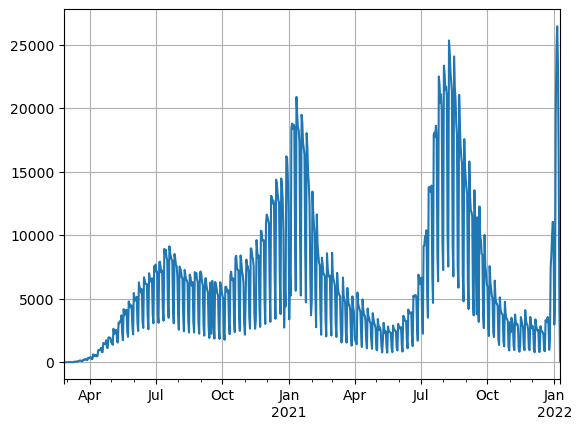
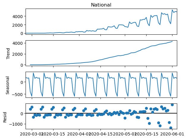
We can see three clear peaks in daily cases, corresponding to the first 3 waves of the pandemic in the country. The time series shows highly perdiodic behaviour let’s decompose the first 150 observations into its trend seasonal and residual parts.
1
2
3
from statsmodels.tsa.seasonal import seasonal_decompose
seasonal_decompose(nation[:100]).plot()
plt.show()
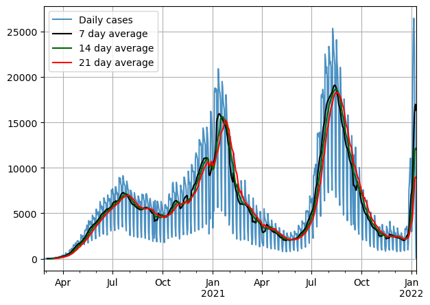
There’s a clear upward trend at the beginning of the pandemic. Additionally, strong seasonality is evident in the data, and the residuals also exhibit some periodicity. This seasonality could potentially be attributed to a shortage of staff members collecting patient information during weekends, rather than indicating an actual drop in cases. A common approach for addressing this type of time series pattern is to apply smoothing using a moving average technique. This involves calculating the average of the last $n$ observations.
Given that the decline in cases seems to occur on a weekly basis, it would be appropriate to use a smoothing window of 7 days or any multiple of 7.
1
2
3
4
5
6
7
8
9
10
11
X_sma_7 = nation.rolling(window=7).mean().dropna()
X_sma_14 = nation.rolling(window=14).mean().dropna()
X_sma_21 = nation.rolling(window=21).mean().dropna()
plt.figure(figsize=(7,5),dpi=100)
nation.plot(label = 'Daily cases', alpha=0.8)
X_sma_7.plot(color = 'black',label = '7 day average')
X_sma_14.plot(color = 'darkgreen', label = '14 day average')
X_sma_21.plot(color = 'red', label = '21 day average')
plt.grid()
plt.legend()
plt.show()
Important to note that as we increase the window the series becomes much smoother.
Data transformations and model selection
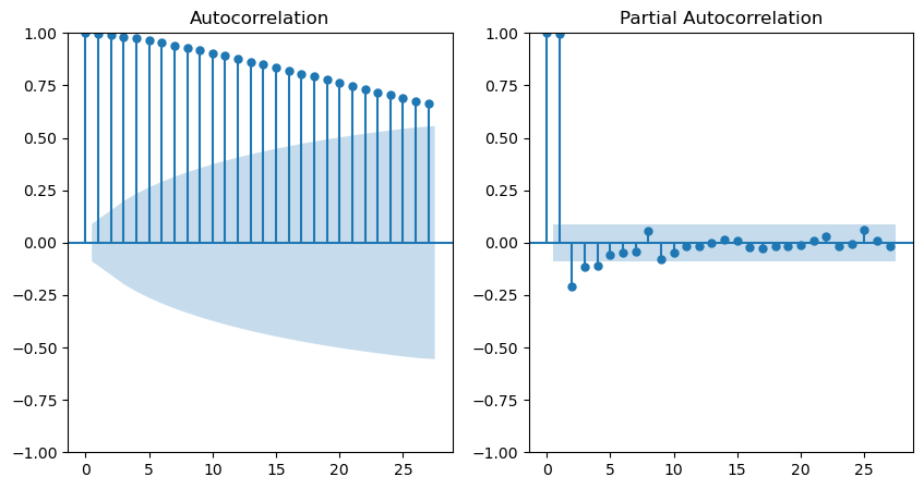
The next step in the time series workflow is model selection. When utilizing ARIMA models a common practice is to determine the coefficients using plots of the Autocorrelation and Partial Autocorrelation Functions (ACF & PACF).The former represents the correlation between the series and its past values, while the latter signifies the autocorrelation among the residuals of an auto-regressive model. These plots are also highly beneficial for identifying patterns in the data and ascertaining whether the series is stationary.
For the purposes of this exercise, we will truncate the series for training starting from July 1st, 2021. This date was chosen as it marked a period when cases were experiencing an increase, and forecasting future daily cases held significant general interest.
1
2
3
4
5
6
7
8
from statsmodels.graphics.tsaplots import plot_acf, plot_pacf

train = X_sma_7[X_sma_7.index < pd.to_datetime('2021-07-01')]
fig, axes = plt.subplots(nrows=1, ncols=2, figsize=(10, 5), sharex=True)
axes = axes.ravel()
plot_acf(train, ax=axes[0])
plot_pacf(train, ax=axes[1])
plt.show()
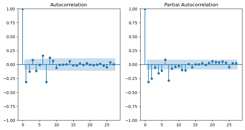
Regarding the smoothed series, the Autocorrelation Function (ACF) displays a decreasing trend, while the Partial Autocorrelation Function (PACF) exhibits significant peaks at lags 1 and 2. This observation implies that the series’s dependence is primarily on the preceding 2 days. Consequently, the most suitable model would be an AR(2).
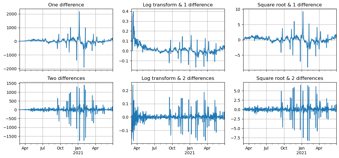
To induce stationarity, it’s common to take one or two differences. Other transformations, such as applying the natural logarithm or taking the square root of the series, can also be employed to mitigate the impact of extreme values. Let’s proceed by examining this transformed series.
1
2
3
4
5
6
7
8
9
fig, axes = plt.subplots(nrows=2, ncols=3, figsize=(14, 6), sharex=True)
axes = axes.ravel()
train.diff().plot(ax = axes[0], title="One difference", grid=True)
np.log(train).diff().plot(ax = axes[1], title="Log transform & 1 difference", grid=True)
np.sqrt(train).diff().plot(ax = axes[2], title="Square root & 1 difference", grid=True)
train.diff().diff().plot(ax = axes[3], title="Two differences", grid=True)
np.log(train).diff().diff().plot(ax = axes[4], title="Log transform & 2 differences", grid=True)
np.sqrt(train).diff().diff().plot(ax = axes[5], title="Square root & 2 differences", grid=True)
plt.show()
It’s apparent that with just one difference, the series’s mean continues to exhibit temporal variation. This issue can be addressed by taking an additional difference. Nevertheless, despite applying log or square root transformations, the variance of the series remains variable. Upon examining these graphs, the most viable approach might be to combine the log transformation with a second-order integration (2 differences).
1
2
3
4
5
fig, axes = plt.subplots(nrows=1, ncols=2, figsize=(10, 5), sharex=True)
axes = axes.ravel()
plot_acf(np.log(train).diff().diff().dropna(), ax=axes[0])
plot_pacf(np.log(train).diff().diff().dropna(), ax=axes[1])
plt.show()
Looking at the ACF and PACF plots for this transformed series, we may be looking at an ARMA process here.
Model Fitting and validation
To determine the exact order of the ARIMA model we use the auto_arima function from the pmdarima package. This function will quickly fit models and compute the AIC, the model with the highest AIC is selected.
1
2
3
import pmdarima
arima_model = pmdarima.arima.auto_arima(np.log(train), d=2)
arima_model.summary()
| Dep. Variable: | y | No. Observations: | 485 |
|---|---|---|---|
| Model: | SARIMAX(1, 2, 1) | Log Likelihood | 930.381 |
| Date: | Tue, 29 Aug 2023 | AIC | -1854.762 |
| Time: | 15:14:32 | BIC | -1842.222 |
| Sample: | 0 | HQIC | -1849.834 |
| - 485 | |||
| Covariance Type: | opg |
| coef | std err | z | P>|z| | [0.025 | 0.975] | |
|---|---|---|---|---|---|---|
| ar.L1 | 0.3424 | 0.034 | 10.181 | 0.000 | 0.276 | 0.408 |
| ma.L1 | -0.8842 | 0.024 | -36.850 | 0.000 | -0.931 | -0.837 |
| sigma2 | 0.0012 | 3.64e-05 | 34.120 | 0.000 | 0.001 | 0.001 |
| Ljung-Box (L1) (Q): | 0.22 | Jarque-Bera (JB): | 1859.44 |
|---|---|---|---|
| Prob(Q): | 0.64 | Prob(JB): | 0.00 |
| Heteroskedasticity (H): | 0.77 | Skew: | 0.25 |
| Prob(H) (two-sided): | 0.09 | Kurtosis: | 12.60 |
The function suggest an ARMA(1,1) on the second order integrated and log-transformed series, without any seasonality component. It’s important to note the following from the results:
- The coefficients for the AR and MA components are both statistically significant.
- The Ljung-Box test is showing a p-value greater than 0.05, this means that we fail to reject the null-hypothesis that the residuals are independent (although we should expect something closer to 0.99 with a better model).
- The heteroskedasticity test is showing a p-value greater than 0.05, therefore we can’t reject the null-hypothesis that the error variances are independent (again we would expect to have a higher p-value with a better model).
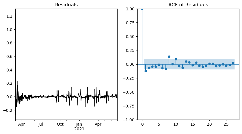
We can perform many tests, but nothing beats looking the graph and check if the model assumptions seem to be fulfilled.
1
2
3
4
5
fig, axes = plt.subplots(nrows=1, ncols=2, figsize=(10,5))
axes = axes.ravel()
pd.Series(arima_model.resid(), index=train.index).plot(color="black", ax=axes[0], title="Residuals")
plot_acf(arima_model.resid(), title="ACF of Residuals", ax=axes[1])
plt.show()
From this graph, it is evident that while the mean seems to be independent of time, there are periods where the variance is significantly higher, indicating the presence of heteroskedasticity. In an ideal scenario, a perfect model would yield Gaussian noise behavior. The ACF plot demonstrates a few significant peaks, notably at lags 1 and 8. This outcome is suboptimal and further confirms the likelihood of some correlation within the residuals.
While this model isn’t perfect by any means, it’s probably as good as it gets for this dataset.
Forecasting
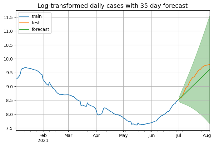
We will use the model to predict 30 days in the future.
1
2
3
test = X_sma_7[X_sma_7.index >= pd.to_datetime('2021-07-01')][:35]
prediction, confint = arima_model.predict(n_periods=35, return_conf_int=True)
prediction
1
2
3
4
5
6
7
array([8.52809307, 8.55922593, 8.59075826, 8.62242736, 8.65414329,
       8.68587525, 8.7176127 , 8.74935204, 8.78109201, 8.81283221,
       8.84457248, 8.87631278, 8.90805309, 8.9397934 , 8.97153371,
       9.00327402, 9.03501433, 9.06675464, 9.09849496, 9.13023527,
       9.16197558, 9.19371589, 9.2254562 , 9.25719652, 9.28893683,
       9.32067714, 9.35241745, 9.38415776, 9.41589808, 9.44763839,
       9.4793787 , 9.51111901, 9.54285932, 9.57459964, 9.60633995])
1
2
3
4
5
6
7
8
9
10
11
12
cf = pd.DataFrame(confint)
prediction_series = pd.Series(prediction,index=test.index)
fig, ax = plt.subplots(1, 1, figsize=(8,5))
np.log(train[-180:]).plot(ax=ax, label="train")
np.log(test).plot(ax=ax, label="test")
ax.plot(prediction_series, label="forecast")
ax.legend(loc="upper left")
ax.fill_between(prediction_series.index,
                cf[0],
                cf[1],color='green',alpha=.3, label="CI")
ax.set_title("Log-transformed daily cases with 35 day forecast", fontsize=14)
ax.grid()
As we can see the model is succesfully able to capture the upward trend of the series, but a major limitation of these models is their unability to determine when a peak is coming. Next step is to measure the performance of the model on the testing set, we will do this using the root mean square error, mean absolute error and mean absolute percentage error from the sklearn package.
1
2
3
4
5
6
7
8
from sklearn.metrics import mean_absolute_error, mean_absolute_percentage_error, mean_squared_error, r2_score

metrics = pd.DataFrame({"MAE": mean_absolute_error(test, np.exp(prediction)),
                        "RMSE": np.sqrt(mean_squared_error(test, np.exp(prediction))),
                        "MAPE": mean_absolute_percentage_error(test, np.exp(prediction)),
                        "R2": r2_score(test, np.exp(prediction))},
                      index=range(1))
metrics
| MAE | RMSE | MAPE | R2 | |
|---|---|---|---|---|
| 0 | 2634.686582 | 3094.601593 | 0.19656 | 0.4955 |
Conclusion
In this post we looked at how to approach time series problems using the Box-Jenkins method and ARIMA models. In my opinion is clear that for this type of data these models might not be the best match, given that there are a lot of external variables, population constrains and health measures taken by the authorities that affect the behavior of the series.
