Data
In this post we will build and evaluate two bayesian models to predict the probability of a driver finishing in the top 5 of a given race. The data was scrapped from the FIA’s website, check out part 1, for more information on webscrapping. The raw data was later transformed using another script which you can find in my github repo. Specifically the following modifications were made:
- The Indy-500 race was dropped since most regular F1 drivers didn’t participated in it.
- Observations that had two drivers were separated into two rows, with all other variables equal. (If two drivers shared one car in a race and scored points, these were divided equally between them).
- Make sure a driver only appear once in a grand prix, if he had two or more entries the one with the most amount of laps was kept.
- Lap time, total race time, and best lap of the race were all character variables, which were transformed to total seconds.
- Race position contained “DNF” (Did Not Finish) indicators, which were set to 99, and missing values too.
- The engine variable was transformed to only display the manufacturer, leaving out model number and other additional information.
- Teams and engines were transformed to factor variable, those that didn’t appear more than 10 times in the whole dataset were set to “other”.
- Teams that only had one distinct driver in the whole dataset were set to “solo”.
For these transformed version of our dataset had 828 rows with 141 different drivers, 17 teams and 13 different engine manufacturers.
First we need to load the necessary libraries. We will use tidyverse for data manipulation and plotting. We will be running models using stan and the rstan package. To analyze the results we will use the tidybayes library.
1
2
3
4
library(tidyverse)
library(tidybayes)
library(viridis)
library(rstan)
Before start fitting any models we need to load the data.
1
data_model <- read.csv("https://raw.githubusercontent.com/abraham-mv/formula-1/main/data/data_for_model.csv") |> select(-X)
In Formula 1, the drivers’ ability isn’t the most important factor on where will they finish a race, the machinery underneeth them is. That being said let’s look at proportions of race positions by engine manufacturer.
1
2
3
4
5
6
7
8
9
data_model |>
mutate(engine_index = factor(engine_index),
         race_pos = ifelse(race_pos == 99, NA, race_pos)) |>
  ggplot(aes(race_pos, fill = new_engine)) +
   geom_bar(aes(y = ..prop..)) +
  theme_bw(base_size = 12) + xlab("Race position") +
  ylab("Proportions") + ggtitle("Race positions by engine manufacturer") +
  scale_fill_viridis(discrete = T, name=NULL) +
  scale_x_continuous(breaks = seq(2,22,2)) + scale_y_continuous(breaks = seq(0,1.8,0.2))
We can see how dominant certain engine manufactures were in the early days of the sport, as the proportions of finishing first and second in the race were completely occupied by just four manufactures: Alfa Romeo, Ferrari, Maserati and Mercedes. Below we can see the distribution of
1
2
3
4
5
6
data_model |>
  group_by(Driver) |>
  mutate(appear = n()) |>
  filter(appear > 10) |>
  ggplot(aes(Kph, Driver, fill = Driver)) + geom_boxplot() + theme_bw() +
  theme(legend.position = "none") + scale_fill_viridis(discrete = T)
Candidate models
Given that the outcome variable is binary, we will fit a Bayesian logistic regression model (fixed effects). Also, based on the EDA, it might be a good idea to model some variables hierarchically (i.e mixed effects model). The first Bayesian logistic regression is described by the following equation:
\[\begin{aligned} y_i | \theta_i &\sim \text{Bernoulli}(\theta_i) \\ \text{logit}(\theta_i) &= \beta_0 + \beta_1x_{\text{quali-pos}} + \beta_2x_{\text{avg-speed}} + x^\top_{\text{engine}}\boldsymbol{\beta_3} + \beta_4x_{\text{champ-points}} \\ \beta_0,\dots,\beta_4&\sim N(0,1) \end{aligned}\]For the mixed effects model, we will model the drivers, teams and engine manufacturers hierarchically.
\(\begin{aligned} y_i | \theta_i &\sim \text{Bernoulli}(\theta_i) \\ \text{logit}(\theta_i) &= \alpha_0 + \alpha^{\text{driver}}_{d[i]}x_{\text{quali-pos}} + \alpha^{\text{team}}_{t[i]} + \alpha_{e[i]}^{\text{engine}} \\ \alpha^{\text{driver}}_d &\sim N(\mu_d^{\text{driver}}, \sigma_d^{\text{driver}}) \\ \alpha^{\text{team}}_t &\sim N(\mu_t^{\text{team}}, \sigma_t^{\text{team}}) \\ \alpha^{\text{engine}}_e &\sim N(\mu_e^{\text{engine}}, \sigma_e^{\text{engine}}) \\ \mu_d^{\text{driver}}&\sim N(0,1)\\ \mu_d^{\text{team}}&\sim N(0,1)\\ \mu_d^{\text{engine}}&\sim N(0,1)\\ \sigma_d^{\text{driver}}&\sim N^+(0,1)\\ \sigma_d^{\text{team}}&\sim N^+(0,1)\\ \sigma_d^{\text{engine}}&\sim N^+(0,1)\\ \alpha_0 &\sim N(0,1) \end{aligned}\)
- $y_i$: 1 if the driver at observation $i$ scored points, 0 otherwise.
- $x_{\text{quali-pos}}$: the position the driver qualified (started the race).
- $d[i]$: indicates who’s the driver in row $i$ of the dataset; $d\in{1,\dots,141}$
- $t[i]$: indicates the team the driver in row $i$ is driving for; $t\in{1,\dots,17}$
- $e[i]$: indicates the engine the team in row $i$ is using; $e\in{1,\dots,13}$ Here we have two variable intercept corresponding the team and engine, and a coefficient for the qualifying position which varies with the driver.
Running the models
To run the models we will use stan. Below is the code for the first one. Instead of specifying each feature individually, we can give stan a covariate matrix, and let it now that the beta coefficients are in vector format.
1
2
3
4
5
6
7
8
9
10
11
12
13
14
15
16
17
18
19
20
21
22
23
24
25
26
27
28
29
30
data {
  int<lower=0> N; // Number of observations
  int<lower=0> K; // Number of features
  int<lower=0, upper=1> y[N]; // Outcome variable
  matrix[N, K] X;
}
parameters {
  vector[K] beta; // Vector of coefficients
}
transformed parameters{
  vector[N] theta;
  theta = X * beta; // Specifying the theta parameter for the bernoulli dist.
}

model {
  beta ~ normal(0,1);
  y ~ bernoulli_logit(theta);
}
generated quantities {
  // simulate data from the posterior
  vector[N] y_rep;
  // log-likelihood posterior
  vector[N] log_lik;
  for (i in 1:num_elements(y_rep)) {
    y_rep[i] = bernoulli_rng(inv_logit(theta[i]));
  }
  for (i in 1:num_elements(log_lik)) {
    log_lik[i] = bernoulli_logit_lpmf(y[i] | theta[i]);
  }
}
The second model is not a lot more complicated, we just need to feed stan with much more information, like number of drivers, teams and engines, and an id for all of those. It’s important to make sure that all standard deviations are bigger than zero!
1
2
3
4
5
6
7
8
9
10
11
12
13
14
15
16
17
18
19
20
21
22
23
24
25
26
27
28
29
30
31
32
33
34
35
36
37
38
39
40
41
42
43
44
45
46
47
48
49
50
51
52
53
54
55
56
57
58
59
60
61
62
data {
  int<lower=0> N;  // number of observations
  int<lower=1> D;  // number of drivers
  int<lower=1> T;  // number of teams
  int<lower=1> E;  // number of engines
  int<lower=1> Y;  // number of years
  int driver[N];    // driver ID of each observation
  int team[N];      // team ID of each observation
  int engine[N];    // engine ID of each observation
  int grid[N];      // starting grid position of each observation
  int finished[N];  // binary outcome of each observation (0 = outside top 5, 1 = inside top 5)
  int num_races[N]; // number of races each driver participated in
}

parameters {
  real Intercept;
  vector[D] driver_effect;
  vector[T] team_effect;
  vector[E] engine_effect;
  real driver_mu;
  real<lower=0> driver_sd;
  real team_mu;
  real<lower=0> team_sd;
  real engine_mu;
  real<lower=0> engine_sd;
}

transformed parameters{
  vector[N] theta;
  for (n in 1:N){
    theta[n] = Intercept + driver_effect[driver[n]]  * grid[n] +
                       team_effect[team[n]] + engine_effect[engine[n]];
  }
}

model {
  // Priors
  Intercept ~ normal(0, 1);
  driver_effect ~ normal(driver_mu, driver_sd);
  team_effect ~ normal(team_mu, team_sd);
  engine_effect ~ normal(engine_mu, engine_sd);
  driver_mu ~ normal(0, 1);
  driver_sd ~ normal(0, 1);
  team_mu ~ normal(0, 1);
  team_sd ~ normal(0, 1);
  engine_mu ~ normal(0, 1);
  engine_sd ~ normal(0, 1);

  // Likelihood
  finished ~ bernoulli_logit(theta);
}

generated quantities {
  real y_rep[N];
  vector[N] log_lik;
  for (n in 1:N) {
    y_rep[n] = bernoulli_logit_rng(theta[n]);

    log_lik[n] = bernoulli_logit_lpmf(finished[n] | theta[n]);
  }

}
Now that we have the code for both our models we can run them from R.
1
2
3
4
5
6
7
8
9
10
11
12
13
14
15
n_total <- length(data_model[,1])
quali_pos <- data_model$Pos
kph_cent <- data_model$Kph - mean(data_model$Kph)
engine <- data_model$new_engine
wdc_points <- data_model$wdc_points_shift
y <- data_model$points

covariates <- cbind(rep(1, n_total), quali_pos, kph_cent, model.matrix(~engine)[,-1], wdc_points)
stan_data <- list(
  N = n_total, K = dim(covariates)[2],
  X = covariates,
  y = y
)
simple_mod <- stan(data = stan_data, file = here("model1.stan"),
                   chains = 4, iter = 1000, cores = 2)
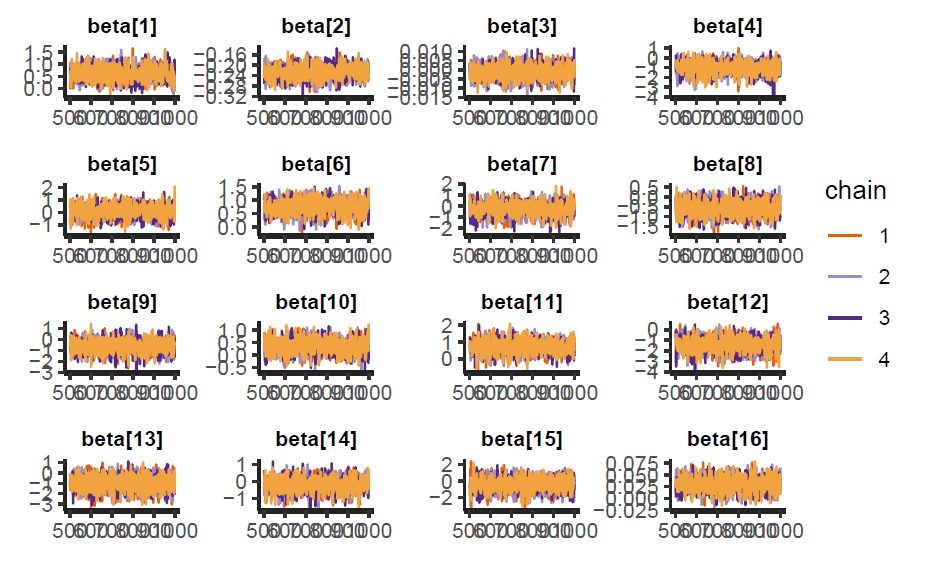
We can analyzed the sampling behavior of the model using traceplots and pair plots. In the figure below we can see that the chains are mixing correctly for all coefficients.
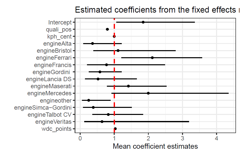
The estimated mean coefficients for each variable are shown below in the odds scale, with their respective 95% CI’s (credible intervals). We can see that the qualifying position, which is also the starting position for the race, has a very significant impact in the odds of scoring points. For the engine variable the model is taking Alfa Romeo’s engine as a baseline. We can see that a driver with a Ferrari engine has almost twice the odds of scoring points than one with an Alfa Romeo engine. This is surprising as many smaller teams used Ferrari power units, however, Scuderia Ferrari as a team had highly dominant years in this time period. We can see that the current WDC points had little to no impact in the odds of scoring points in a given race, this might be due to the variability of championship fights from year to year, in some years one driver is very dominant so he will have a lot of points accumulated, while in others the field is much closer togther, resulting in all drivers having less points.
1
2
3
4
5
6
7
8
9
10
colnames(covariates)[1] <- "Intercept"
variables <- factor(colnames(covariates), levels = colnames(covariates))
as_tibble(summary(simple_mod)$summary[1:16,c(4, 1, 8)] ) |> exp() |>
  mutate(covariate = variables) |>
  ggplot(aes(x = mean, y = covariate)) + geom_point() +
  scale_y_discrete(limits = rev) +
  geom_pointinterval(aes(xmin = `2.5%`, xmax = `97.5%`)) +
  geom_vline(xintercept = 1, col = "red", linetype = 2, linewidth = 0.85) +
  xlab("Mean coefficient estimates") + ylab("") + theme_bw(base_size = 12) +
  ggtitle("Estimated coefficients from the fixed effects model")
Hierarchical model
1
2
3
4
5
6
7
8
9
10
11
12
13
14
15
16
17
18
19
n_total <- length(data_model[,1])
n_years <- length(years)
n_drivers <- length(unique(data_model$Driver))
n_races <- length(unique(data_model$Date))
race_index <- data_model$race_index

stan_data <- list(
  N = n_total,
  D = n_drivers,
  T = length(unique(data_model$team_index)),
  E = length(unique(data_model$engine_index)),
  Y = n_years,
  race = race_index, driver = data_model$driver_index,
  team = data_model$team_index, engine = data_model$engine_index,
  grid = data_model$Pos, num_races = data_model$exp, finished = data_model$points
)

model_hierar_1 <- stan(file = here("Project/stan_code/model1.stan"),
                      data = stan_data, chains = 4, iter = 5000, cores = 4)
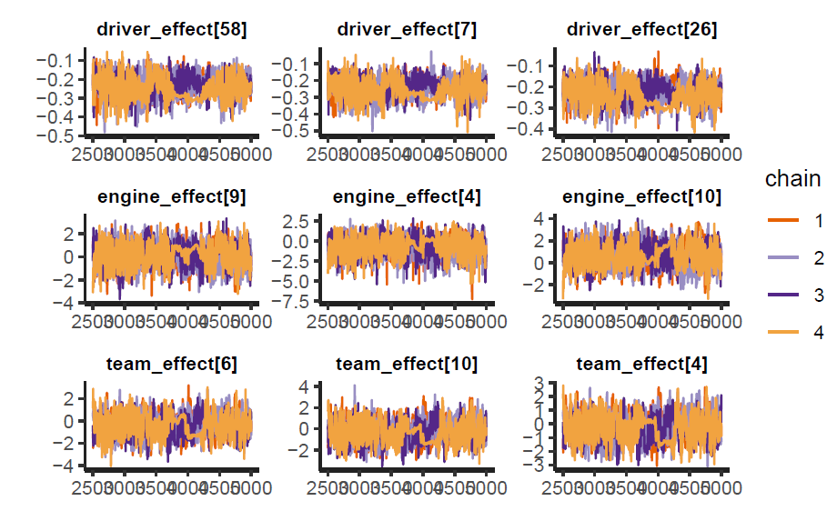
The sampling was ran for 5000 iterations and 4 chains, up to the writing of this report there are still divergent chains for some of the variables, however, this model is still relevant because is the one that yielded the best results, and it’s also the one achieving the largest elpd (see next subsection). We can take a sample of the parameters and look at their traceplots.
1
2
3
traceplot(model_hierar_1, pars = c(paste0("driver_effect[",sample(1:140, 3),"]"),
                                   paste0("engine_effect[",sample(1:10, 3),"]"),
                                   paste0("team_effect[",sample(1:10, 3),"]")))
As we can see the chains are mixing, although these could be improved further. Joint distribution of the parameters look good, with no apparent divergent behavior.
Evaluation and comparison
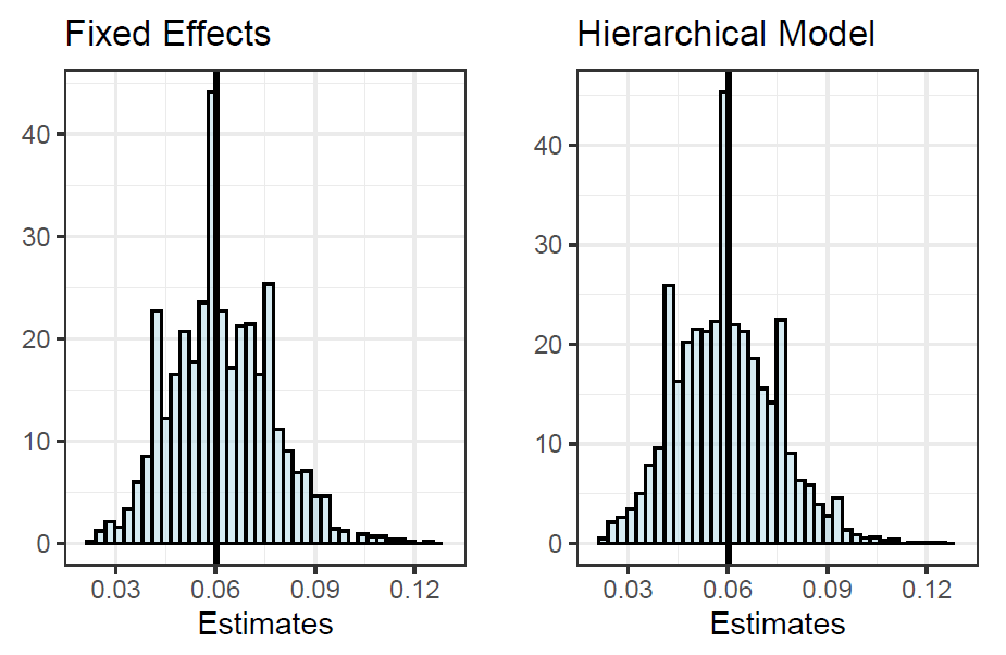
Posterior predictive checks were made for both models in order to compare how well they are fitting the data. The proportion of drivers who finished in the points starting from a grid position of tenth or lower was chosen as a test statistic. In the figure below we can see that the distributions of both models look almost exactly the same, with the true proportion centered around the mean of the distributions. This means that the models are good fit for the data, and that they can predict the outcome variable of interest successfully.
1
2
3
4
5
6
7
8
9
10
11
12
13
14
15
16
17
18
19
20
21
22
23
24
25
26
group_stat <- function(model, title){
grid_position <- 10
true_value <- sum(data_model$points == 1 & data_model$Pos > grid_position) /
              sum(data_model$Pos > grid_position)

yrep <- extract(model)[["y_rep"]]

p1 <- data.frame(t(yrep)) |>
  mutate(quali_pos = data_model$Pos) |>
  mutate(across(-quali_pos,
                ~ sum(.x == 1 & quali_pos > grid_position)/sum(quali_pos > grid_position))) |>
  sample_n(1) |>
  pivot_longer(cols = -quali_pos, names_to = "itereation") |>
  ggplot(aes(value, y=..density..)) +
  geom_histogram(alpha = 0.5,fill = "lightblue", col = "black", bins = 40) +
  geom_vline(
    xintercept = true_value,
    color = "black", linewidth = 1) +
  theme_bw(base_size = 12) +
  ggtitle(title) + ylab("") + xlab("Estimates") +
  scale_x_continuous(breaks = seq(0.03, 0.12, 0.03), limits = c(0.02, 0.13))
return(p1)
}
p1 <- group_stat(simple_mod, "Fixed Effects")
p2 <- group_stat(model_hierar_1, "Hierarchical Model")
grid.arrange(p1, p2, nrow = 1)
The models had very similar $\text{elpd}_{\text{loo}}$, there was a difference between them of 2, with a standard error of 3.2, with the hierarchical model having the higher value. Given that the difference is smaller than the standard error, we can’t infer with enough statistical confidence that the second model is better. The fixed effects model had all Pareto parameters $k$ lower than 0.5, while the hierarchical model had 22 $k$ parameters higher than 0.5, which accounts for 2.5%.
1
2
loo1 <- loo(simple_mod)
loo2 <- loo(model_hierar_1)
In the figure below we can see that both models are performing very similar according to the $\text{elpd}_{\text{loo}}$ criterion.
1
2
3
4
5
6
7
8
9
10
11
12
elpd_models <-
data.frame(elpd_mod1 = loo1$pointwise[,1],
           elpd_mod2 = loo2$pointwise[,1],
           points = as.factor(data_model$points),
           pos = data_model$Pos)
p1 <- elpd_models |>
  ggplot(aes(x = elpd_mod1, y=elpd_mod2, col = points)) +
  geom_point(alpha = 0.5) + theme_bw(base_size = 12) + geom_abline() +
 ggtitle("ELPD values for both models") +
  theme(legend.position = c(0.06,0.85)) + xlab("Simple Logistic Regression") +
  ylab("Hierarchical Model")
p1
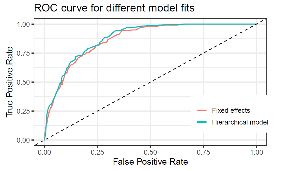
 The receiver operating characteristic (ROC) curve was plotted for both models, although running the models with less iterations showed a significantly higher performance for the hierarchical model, for this final version they are very similar. The area under the curve (auc) was found to be slightly higher for the hierarchical model with 0.8783 than the fixed effects model with 0.8671. Overall this are very good results.
1
2
3
4
5
6
7
8
9
10
11
12
13
14
15
16
17
18
19
20
21
22
23
24
25
26
27
28
29
30
31
32
33
34
35
36
37
38
39
40
41
42
43
44
45
inv.logit <- function(x){
  return(exp(x)/(1+exp(x)))
}

false_positive_rate <- function(prediction, true){
    fp <- sum(true != prediction & prediction == 1)
    tn <- sum(true == prediction & true == 0)
    return(fp/(tn+fp))
}

true_positive_rate <- function(prediction, true){
  tp <- sum(true == prediction & prediction == 1)
  fn <- sum(true != prediction & prediction == 0)
  return(tp/(tp+fn))
}

roc_curve_tibble <- function(true, pred_probs, name = ""){
  thresholds <- seq(0,1,0.01)
  y_pred <- sapply(thresholds, function(x)ifelse(pred_probs > x, 1, 0))
  tpr <- sapply(1:length(thresholds), function(x)true_positive_rate(y_pred[,x], true))
  fpr <- sapply(1:length(thresholds), function(x)false_positive_rate(y_pred[,x], true))
  model_name <- rep(name, length(thresholds))

  return(as_tibble(cbind(model_name, fpr, tpr)))
}

predicted_probabilities <- function(model){
  thetas <- summary(model)$summary[paste0("theta[",1:n_total,"]"),1]
  return(inv.logit(thetas))
}

roc_tibble_1 <- roc_curve_tibble(y, predicted_probabilities(simple_mod),
                                 name = "Fixed effects")
roc_tibble_2 <- roc_curve_tibble(y, predicted_probabilities(model_hierar_1),
                                 name = "Hierarchical model")

rbind(roc_tibble_1, roc_tibble_2) |>
  mutate(fpr = as.numeric(fpr), tpr = as.numeric(tpr)) |>
  ggplot(aes(fpr, tpr, col = model_name)) +
  geom_line(linewidth = 0.7) +
  theme_bw(base_size = 13) +
  theme(legend.position = c(0.85,0.25)) +
  geom_abline(linetype = 2) + scale_color_discrete(name = NULL) +
  xlab("False Positive Rate") + ylab("True Positive Rate") +
  ggtitle("ROC curve for different model fits")
